
Project Team
design: K.S.I.D
Suppliers
lighting: Fat Shack Vintage, Few and Far, Six Things
furniture: Café Ideas, Matt Blatt, Rustix Furniture
tiles: The Surface Gallery, Di Lorenzo Tiles
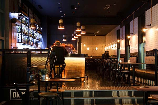


The space is quite narrow and elongated with angular walls, a split-level floor and high ceilings. The challenge was to activate the entire volume of the interior by creating a scheme that read cohesively throughout, and worked to create more of a relationship between the
different surfaces and various planes.
Because of the interesting footprint of the space and its city location – K.S.I.D wanted to create an interior that was more dramatic and enticing from the street front, as well as giving it an urban, slightly vintage, and industrial feel to better suit the existing building.
The material palette aimed to highlight some of the existing concrete surfaces, which were further complimented by the introduction of new copper accents, handmade subway tiles and industrial furniture.
During demolition it was discovered that the old, built-in bench seating had been concealing a large, concrete structural column on the floor.
K.S.I.D were able to retain this ‘find’ as a feature, and it was integrated into the design of the timber drinks ledge – becoming a raw, concrete footrest along the right-hand side – at the rear of the space.
The main bar structure was retained and refurbished within the new design. The location of this existing base ‘bar’ then helped to determine the layout of the rest of the space.
The main client consideration for the spatial planning was to re-organise the existing space so that it could comfortably host more guests. This was achieved through the introduction of high bar seating, and timber bar ledges – which utilised the narrow sections of the existing space, and awkward nooks around the existing stairs.
Handmade rectangular tiles were sourced and installed in a brick format to the walls to replicate the aesthetic of a ‘subway’ – this is particularly effective in the rear section of the interior where the ceiling is lower and the space is at its narrowest.
A new bench seat was constructed to create a dining zone opposite the main bar – combining black bentwood chairs, and distressed stainless steel tables. Custom, upholstered, backrest pads were hung from the wall on copper hooks to visually harden the otherwise ‘soft aesthetic’ of the upholstery – and bring these in line with the ‘industrial qualities’ of the overall concept.
The concrete columns and concrete finish on the rear wall were original, and were preserved and integrated into the overall palette.
The original bar was re-instated, and the previous highly polished timber was stripped back to its’ raw and more natural form. Left untreated and more textural, the timber materiality is further complimentary to the rawness of the concrete and copper accents
throughout.
To further distinguish the ‘Bar’ area, K.S.I.D added a black industrial foot rail, and black ledge overhang which now enables guests the option to enjoy a drink at the bar.
New copper pendant lighting was also installed above the bar, and by lowering these lights overhead K.S.I.D were able to give the illusion of visually lowering the ceiling and further defining this area as the ‘Bar’.
Printed tiles were used to clad the base of the new bench seat joinery, and as a splashback tile behind the bar. Their print provided an added graphic quality and almost three-dimensional effect. This was also an opportunity for K.S.I.D to introduce a hint of colour to a mostly black, white and natural palette.
Black venetian blinds were installed on to the high windows throughout and purposely positioned down on the window. This method again worked to lower the proportions of the ceiling and height of the space.
These have been particularly successful at creating uniformity and symmetry behind the new bench seating, and subtely highlight the gold foil logos installed to the shopfront glazing.
Vintage metal wall lights and industrial cage wall lights were sourced, and installed as a feature to the walls using an exposed copper conduit detail. This helped to reduce both the cost of concealing wiring, and added to the ‘industrial subway’ feel of the space.
K.S.I.D created a grid layout of bulb lights to the ceiling at the bar entrance. The bulb light was selected for its simplicity and the grid like format takes its inspiration from lighting sometimes seen under the street front awning of an old theatre, or an old Broadway venue.
Custom marquee letter lights were sourced as both a “hero” element, and to play on the history of The Basement establishment being used for live music and performance over the years. Their placement on the large left-hand wall can also be appreciated from the street front so they work both as a draw card for passers-by, and as a decorative focal point especially in the evening.
“I love the copper and turned-timber pendant lights installed above the bar and I think that they are very successful in giving the bar a real presence,” said Kylie. “I also love that notes and pencil calculations from the Builders were preserved on the concrete wall at the rear of the interior! The brown paper menu roll that has been installed above the bar is also a great solution aesthetically, as well as functionally – for hand-written wine lists and menu specials.
“I definitely think the volume of space has been more effectively activated with more careful consideration for the placement of decorative treatments, finishes, lighting and layering to enhance the existing parameters of the interior. The renewed materiality is also successful in presenting a completely new atmosphere within the space. It is now much more alluring from the street – urban, industrial and classic, with a subtle vintage edge.”
The Project Managers for the refurbishment of the Upstairs Bar were Coreserve Pty Ltd, who managed various consultants and trades to implement the scheme.
Southern Design were enlisted to re-brand the Upstairs Bar logo and to assist with creating some catchy taglines, that further play on the ‘upstairs’ location of the bar, and that could be rolled out into the space. The visual aesthetic of the logo was also replicated into statutory signage for services, decorative signage, custom drinks coasters and other printed mediums.