
Project Team
Design: response-group australia
Suppliers
Carpet: Feltex
Furniture: Koskela, Cubus Concepts,
Light fittings: ECC, Euroluce, JSB, Yellow Goat
Wallpaper: South Pacific, Ashcraft & Decortex, Baresque
Fabrics: Austex, Mokum, Elliott Clark, Kvadrat Maharam
The newly named The Sussex Hotel - formerly known as Moreton’s Hotel - is located in the Eastern Darling Harbour (Barangaroo) end of Sussex Street. Originally built in 1840 - it is a historic Sydney landmark.
This end of the CBD has undergone significant development and this venue was refurbished to appeal to the new local demographic and clientele. The brief was to completely change the identity of Moreton’s Hotel and to create a bar with a quality food offer to appeal to the new businesses moved to the area. The Sussex is next door to the Westpac building, down the road from the new Macquarie bank building and opposite American express and KPMG. To enhance the change of identity the name was removed and more relevant name was chosen The Sussex Hotel or The Sussex for short.
response-group australia were asked to concept all floors of the building being ground – pub and beer garden, 1st floor function room, 2nd floor bar, 3rd floor function rooms and the roof terrace. The idea was to create a building offering a variety of entertainment.
The venue consists of a ground floor bar, middle bar, gaming room and the large alfresco courtyard popular with lunch timers.
The ground floor refurbishment compliments the significant heritage features of the building. The bold blue backed feature bar with timber panelling is the most dominant feature of the ground floor bar. When highlighted by the natural afternoon light the ambience is Old English Charm. This brief was to create a warm atmosphere similar to a local pub that patrons could put there feet up watch some sport but still feel comfortable within stylish environment.
The concept of the interconnecting staircase which links all floors was to enhance its appearance to continue until eternity a bit like an Escher drawing but still compliment its heritage significance.
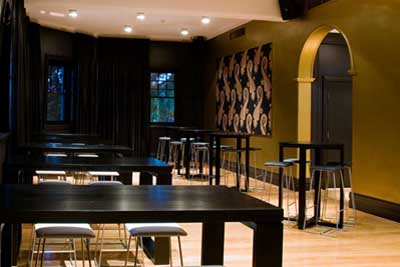
The 2nd floor is a minimal classic pallet of dark aubergine, white, gold and black to highlight the heritage features.
“We really didn’t want to go overboard with design as we wanted to compliment the features,” commented designer Kate Formosa. “The bathrooms are in contrast with bold red and purple for female and male but the gold continues.”
One of the main features is the gold-leafed custom-designed gate and the matching feature light in the entry. This gate was laser cut in metal and hand gold-leafed by ID Colourfield. Another feature is the gold wall which slices through the space.
” To achieve a realistic old gold we used a specialist painter named ID Colourfield,” said kate. “The paint actually contains pigments of gold. The intention of the gold on this particular wall was to create glimpses of gold as patrons looked through the arches and to make a feature of the colonnade looking at the bar.”
Tables are all stained black and accompanied by Koskela white vinyl stools. The timber floor breaks the starkness of the black and white and creates warmth.