Project Team
design: Matt Woods
photos: Dave Wheeler
Suppliers
lighting: Volker Haug, Opal, Euroluce, Dowel Jones
furniture: James Richardson, Dowel Jones,
When first meeting the clients in mid 2016, & with an original working name of the restaurant being Greek word for copper, it was apparent that the owners were looking to feature a heavy use of copper within their new venue. In order not to break the bank, it was decided that the best way to execute their copper clad dreams was with restraint & as a highlight element.
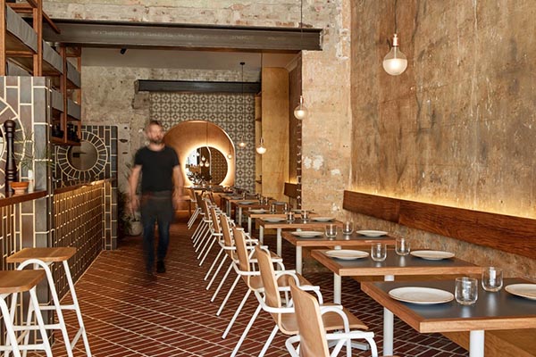
While over time the restaurants name morphed in to OPA – keeping in step with the relaxed intent of the space- the interior concept direction remained the same. In order to compliment the copper tones, & as a nod towards the origins this “native metals” origins, a warm & earthy palette was developed.
The removal & re engineering of 2 central dividing walls, was critical to the success of improving the buildings interior envelope. Clay tiles feature heavily throughout the space & aid in luring & directing patrons into its narrow depths.
These sit along side FSC certified E0 Plywood & reclaimed black butt timbers, with a modest splash of encaustic cement tiles that surround the requisite “Greek arch”.

